Space Engineers

Space Engineers

191 ratings
Paint Shop: An Introduction to More Diverse Color Palettes
By Kraft51 and 1 collaborators
A short guide to help use the Paint menu better, find colors that suit your creations, and a few applications to help make your creations more defined. lets face it people, those stock colors are starting to get hard on the eyes :)
2
   
Award
Favorite
Favorited
Unfavorite
Understanding the Paint Menu Elements
HUE:
This is where you choose the color you would like to work with. Its displayed in degrees because its actually a Color Wheel (see Image 1). In the image you will notice the color with its name and all gradients of that color. I'm not sure why the color selection was set up in this way as there are far better ways to do this, but that is irrelevant at this point.

Image 1


SATURATION:
This is where you choose how intense you would like the color, more specifically, it adjusts the opacity of the color. This is used to create a Matte or Glossy finish, to achieve either of these effects is simple. If you want a Matte finish you lower the Saturation, if you want a Glossy finish you increase it.

VALUE:
This is just where you adjust how dark or light you want your colors.

The screenshot below demonstrates, in extremes, the effects of Satuation and Value adjustment to a single color.

In the following sections i will cover making more effective use of the Paint Menu tools.
Base Colors, Neutrals, Black and White
BLACK AND WHITE:
Being the most misused, black and white applications need to have a little thought behind it. You need to take care with black as it can make parts of your creation disappear, or become muddled amongst the rest of the build and usually should be use for spaces that would natually be dark like impressions in the hull and underneath ribbing.
White on the other hand, white,
white.

With black, I tend to just move the Hue to a dark blue, and Saturation a little above or below zero and then adjust Value until i get a nice semi-gloss black. I like to use the semi-gloss because it reflects just enough light that you can see the edges and lines better.

For white I will use either blue again or yellow, set the saturation really low. And adjust the Value until i get a nice off white. Using blue gives it this soft white tone, easy on the eyes. And using yellow produces more of a warmer eggshell tone, its brighter but not blinding.

NEUTRALS:
Neutrals aren't colors, they are shades much like black and white. They are great for using as a base hull color to build your paintjob from, they are also great for highlighting features and blending rough hull transitions. Neutals are easy to produce, simply drop your Saturation to -100 and set Value to zero and work in increments until you get the shade you desire.


With the Value starting at zero for the first grey, each of the following gradients adjusted in increments of -5

BASE COLOR:
This really comes down to personal preference or whatever color you feel your ship should be. This will be the main color of the hull and all of your highlighting and detailing paint will be built upon this.

ACCENT COLORS:
Finally you want a little contrast, a color that compliments the base color but doesn't blend in and wash away. I like to use a more vibrant color more often than not, say i'm using a grey i then would lean towards an orange or green.

in this screenshot my base color is a Tan, and i've used orange as my accent.
Creating a Build Palette
The Build Palette consists of all of the colors you want to include in your build. Its good to have more than you will actually use in the build itself. I have recently started to find my ships colors before i even start building, and its actually proved to be a much better method than leaving it until the final process.

First step is finding your base color and creating Gradients. In the example below i have used blue and green to demonstrate Gradients. These are the core of your Build Palette as these are the colors


Next add your Neutrals and Accents colors to the palette. Now you are readyto build yourself a Palette Swatch, which is a collection of sample colors from your Build Palette.


As you can see in the screenshot I have to the left I have my base colors in green/brown and on the right is the accent colors in blue gradients. All the Neutrals are a little scattered as this was a Palette swatch from another build.

Another helpful tip using colors, as my friend [UESC] Kilroy had mentioned he likes to color code all of his ships systems, i hadn't considered doing this ever. so i drew up a quick standard to follow, of course you can congigure it to your preference. Color coding your conveyor lines is an excellent way to hunt down and issues you may be encountering

BLUE = Life Support
  • Oxygen tanks
  • Cryo Chambers
  • Med Bays
  • Oxygen Farms
  • Oxygen Generators

GREEN = Cargo/Processing/manufacturing
  • Cargo Containers
  • Sorters
  • Connectors
  • Refineries
  • Assemblers

ORANGE/YELLOW = Fuel/power
  • Batteries
  • Reactors
  • Hydrogen Tanks
  • Jump Drives

RED = Weapons
  • Anything connected to your weapon systems

BLACK = Main Conveyor Line
Basic Aesthetic Applications
In this section i will show you a few applications you can use.

Here i've applied a Base Color of green and applied light and dark Neutrals and alternate Base Colors in the valleys and on the peaks of the transitions. This helps blend a transition more smoothly. Painting any leading edges in lighter colors also helps to define the ships profile.

In this screenshot i've used more bold colors so they don't blend as well, using more subtle colors will make the transition a lot smoother.


Here i'm using a light to manipulate the paint to emulate a more round hole. Looks better when used on an actual build. Once again use more subtle colors to improve the effect, as i used contrasting gradients to demonstrate with.
Potential Guides to Come
Depending on how this one does i may do a guide on more advanced painting effects, and another on finding better hull designs. I'll see how well this one is recieved first so comments are welcome as is constructive criticism and suggestions :) ..... i hope this helps in any way.
Helpful Links
https://www.colormatters.com/color-and-design/basic-color-theory

For those of you who have never had an interior design or well... basically any art course since finger painting, this is a very helpful link that teaches you about color theory.
10 Comments
Kyyiv 9 May, 2020 @ 11:41am 
@TheVortexKey Yes, you can paint something using the middle mouse button while having a block selected in your hotbar.
Kraft51  [author] 19 Feb, 2020 @ 3:22pm 
no worries, color schemes and planning seems to be one of the harder concepts to grasp in SE
TypoTyphon 19 Feb, 2020 @ 10:57am 
As someone whose spent the entire morning reading on the ever exciting subject of Color Theory, this guide was Outstanding. I know this is more than a few years old, but man, what a killer walk through.
Fiction 4 Feb, 2020 @ 3:23pm 
Can you paint something after placing it?
Rebel* 4 Nov, 2019 @ 5:43am 
Is it possible to paint the trim? I'm painting light armour blocks but the frame remains grey.
long chin man 3 Aug, 2019 @ 8:46pm 
this literally teaches you how to properly professionally paint your ship in a spectacular way yet it has 5 comments and 69(nice) ratings
ColonialLobster 11 Dec, 2016 @ 3:15pm 
cool
Procedural Texture 31 Aug, 2016 @ 1:56am 
Here's a useful web-based tool for quickly creating original and pleasing colour palettes:
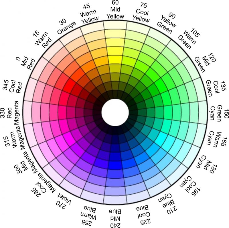
- http://paletton.com/

By all means, create a palette with rich base colours, but then use *mostly* a muted version. Reserve intense colours for decorative effects or identification markings (racing stripes, insignia, ID#, etc). Don crank everything up to maximum unless you want ugly. Less is more.

A couple of less straightforward sites in case paletton isn't doing it for you:
- http://www.colourlovers.com/
- http://web.colorotate.org/
Gorshank 26 Aug, 2016 @ 6:20am 
Excellent guide. Thank you and I look forward to further additions.
Terminal_6 24 Aug, 2016 @ 9:04pm 
I was considering making a guide like this myself, but you guys have probably put more thought into this one than I ever would. I think a lot of people underestimate the capabilities of a thoughtful paint job, and you see a lot of 0-value black ships and accents that don't compliment contours. Hoping this guide makes for more evocative ships across the workshop, I certainly picked up a few things.